Category Archives: Ads & Mailers

My Madison Avenue Moment: Writing an Ad for The Atlantic

mag-issue-large
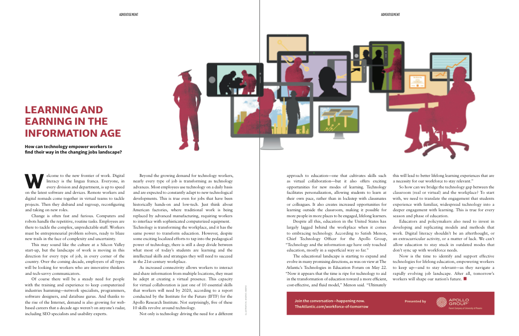
While I’ve occasionally crafted advertising copy for ads appearing in local publications and trade magazines, last year I landed a wonderful opportunity to write a two-page advertorial that appeared in the July/August issue of The Atlantic.

From May to July 2012, I worked with The Atlantic on an integrated marketing campaign that involved attending the magazine’s Technologies in Education Forum, which I live-tweeted, and then writing 18 posts for a sponsored blog (entitled Workforce of Tomorrow) over the next two months. The sponsor of the blog hub was The Apollo Group (parent company to the University of Phoenix), and the marketing package included a two-page advertorial in the print magazine.

I probably don’t have the temperament to work at an ad agency, but I did my best to channel my inner Peggy Olson and deliver top-notch copy. The biggest challenge was that due to design and print production deadlines, the advertorial had to be written long before I had begun working on the blog (or even attended the Tech in Ed event). The  two-page ad was designed to promote The Apollo Group and drive traffic to the online hub.

Click on the image of the ad below to view a full-size PDF.

AtlanticAdvertorial_FullSpread


You’ve Got Mail: Developing a Playful Postcard for HillAds

I frequently do work for my friends at DC Access (a local Internet Service Provider that offers Wifi in DC). Recently, they launched a new business venture called HillAds, which is a hyper-local online advertising network. I helped Martha Huizenga, partner at DC Access, put together a sales flier (I wrote about that project here), and then we worked together on this promotional postcard.

As with the flier, Martha wanted to lay this piece out in-house to save on design costs, so in addition to coming up with some clever copy, I was tasked with developing a visual concept for the piece that could utilize stock images. After exploring several avenues, the idea I proposed was using three side-by-side photos related to subway (Metro) stations – one in Paris, one in Alexandria, VA (part of the DC metropolitan area), and then one on Capitol Hill – to drive home the idea of HillAds being a hyper-local approach to online advertising that targets people who live and work on the Hill.

I was able to locate inexpensive rights-free photos, and I did a rough mock-up of the layout, along with the copy, which Martha then recreated and refined (including consulting with a designer about color and fonts).The result is a cost-effective postcard with a playful design that poses a question to which HillAds is the answer.

This postcard is unusual because there is no branding on the front – the business isn’t named and there isn’t a logo. I wouldn’t always recommend this approach, but the point was to draw people in with an interesting combo of images, pique their curiosity with the copy (which focuses a common pain point for local businesses), and get them to turn the postcard over to learn about a new service that solves the dilemma posed on the front.

Click on the image of the postcard to see a larger version.

Marketing to Missouri: Ad Copy for D.A. Davidson & Co.

In 2011, I worked with Tacklebox Marketing on a trade magazine advertisement for D.A. Davidson & Co., a Kansas City firm that provides financing and underwriting for public projects in municipalities and water districts across Missouri.

The firm’s previous ad contained a lot of great information, but it wasn’t very engaging visually. We saw the opportunity to highlight some of the firm’s key selling points by developing a stronger conceptual frame that would allow the words and images to work together in order to better reach the target audience.

I really enjoy working on projects like this, where the word count is limited and the challenge is to find a good hook and then choose just the right words. Since this branch of the firm only serves clients in Missouri, that allowed me to work on a Missouri-specific theme, which naturally led to the “Show Me State.” Then the trick was to work with that familiar moniker without sounding clichéd (among other things, this phrase appears on the state’s license plates).

I think we struck just the right balance, thanks in large part to great design work by David Tierney. The ad is a two-page spread and it conveys quite a bit of information, but the design pulls your eye to key points and keeps the ad from feeling overwhelming. I think it has great texture and visual appeal, from the sepia-colored map in the background that supports the “across Missouri” messaging, to the clean, well-balanced layout that makes the information easy to access and understand.

Click on the image of the ad to view a larger version.

Real Time Web Analytics