Category Archives: Featured Projects

Let’s Talk: Materials for a Community Conversation about Workforce Development

MMF Let's Talk Booklet Intro PageAs a follow-up to my work on last year’s Beyond Charity report for Montgomery County, MD, this spring I worked with Nonprofit Montgomery to help develop print materials for a Montgomery Moving Forward community conversation held at Discovery Communications on March 31, 2014.

I developed two fact sheets — “Workforce Development Trends” and “Workforce Development in Action” — as well as updating two fact sheets that I created last spring when the Beyond Charity report was initially released.

I also put together a 16-page booklet featuring 30 quotes about workforce development and a one-sheet about Montgomery Moving Forward. I was particularly proud of this piece, as I helped envision a budget-friendly way to format and organize the quotes so that they would be an attractive and compelling addition to the event packet.

Finally, I created a one sheet about Montgomery Moving Forward, drawing on existing materials and boiling them down to key messages.

Booklet: Let’s Talk: Workforce Development in Montgomery County – Voices & Viewpoints

One Sheet: Montgomery Moving Forward

Fact Sheet: Workforce Development Trends

Fresh Messaging for an Established Brand: Capacity Partners Website

CapacityPartners_ScreenshotStrategyPageIn 2013, I worked with Mary Robinson, president and founder of Capacity Partners, to help develop and launch a new website in conjunction with the company’s 10th anniversary. We brought in Beth Ponticello of cr8tivefocus.com (whom I have worked with many times) to customize a WordPress theme, and Beth also developed the company’s beautiful new logo.

I really love the website. It’s crisp and clean, with a slide show on the home page that highlights core messages in a visually engaging way, and a responsive theme that looks good and is easy to navigate across devices. I’ve also worked with Capacity Partners on setting up their new blog in conjunction with the website. Moving forward, I will be helping Mary and her team develop a stronger social media presence, as well as assisting with updates and maintenance on the website.

To explore the full site, visit www.capacitypartners.com


Lofty Words: Blogging from the 2013 Aspen Ideas Festival for The Atlantic

AIF_blogsampleIn June 2013 I got the incredible opportunity to attend the Aspen Ideas Festival. This was my fourth blogging gig for The Atlantic, but the previous three had been from my home base in DC. I jumped at the opportunity to go to Aspen, where I blogged and tweeted about the energy track as part of an integrated marketing project sponsored by Shell. To the right are a sampling of four headlines and deks from the blog that give an idea of the range of topics I tackled.

Prior to heading to Aspen, I wrote two pre-event blog posts, Then, over the course of four frenzied but stimulating days, I attended sessions in the Festival’s “Energy Revolution” track, tweeting highlights from a dedicated AIF2013Energy Twitter stream and then writing eight quick-turnaround blog posts in response to key themes that emerged from the panel discussions. It was a really incredible opportunity to hear experts from across sectors engage in lively conversations about our energy future.

Of course, Aspen was a beautiful and inspiring place for thinking and writing — and while I was very busy working, I did manage to steal away for an afternoon to visit Maroon Lake and get some great shots of the Maroon Bells. My favorite post from the series captures the “Aspenness” of the whole experience, and is accompanied by a photo I took at Maroon Lake: Aspen Provides Panoramic View of Energy Issues. Unlike two of my past blogging gigs for The Atlantic, I did not have a byline for the posts on this project — but I think my voice really comes through on this post. If the link is no longer working (sponsored blogs do not persist on the TheAtlantic.com indefinitely) then you can read the post as a PDF.


Documenting the Economic Impact of Nonprofits: Beyond Charity Report

BCMoCo_coverI worked with Nonprofit Montgomery (an affiliate of the Nonprofit Roundtable of Greater Washington) to create this 20-page report that documents the economic impact of nonprofits in Montgomery County, Maryland.

The report brings together key economic data related to the nonprofit sector from several sources, along with specific examples of nonprofit economic impact. It was released at a special event on Feb. 11, 2013, held at Discovery Communications in Silver Spring, MD.

The report was designed by Beth Ponticello at CEDC. The report had a limited print run, with the primary means of distribution being electronic, and Beth created a QR code for the back page of the report (center of bottom image) and for the poster at the event, to make it easy for people to download a PDF of the report to their phone or tablet.

Download the report as a PDF.


Beyond Charity Montgomery County - Back Cover

Viewbook for The Academy of the Holy Cross: Appealing to Girls and Parents

AHC_samplespreadIn 2012, I worked with Catalone Design to create a viewbook (marketing booklet) for The Academy of the Holy Cross, an all-girls Catholic high school in Kensington, MD. The primary challenge of this piece was coming up with a concept and copy that would speak directly to girls while also appealing to their parents.

To gain a good understanding on the school, I spent the better part of a day on site, along with Lisa Catalone, talking to groups of administrators, teachers (including several alum who are now on staff), and students. Holy Cross had not had a viewbook previously, so we really wanted to deliver a great product that would capture the spirit of the school and support their recruitment efforts.

After the site visit, I proposed several thematic approaches to Catalone to see what sparked their interest from a design standpoint, and we also ran ideas by the school’s director of development. We settled on a series of reflexive headlines speaking directly to girls and built the book around that concept. The cover title is “Find Yourself Here” ( on hard copies, a small purple Holy Cross button – the kind girls might collect and put on their backpacks and jackets– is affixed in the lower-right corner).

Inside, the copy progresses through a series of headlines: Prove Yourself, Push Yourself, Surprise Yourself, Know Yourself, Surprise Yourself, Enjoy Yourself, and Be Yourself. Each headline is followed by a sentence or two of large supporting copy that conveys core messages, followed by several short paragraphs in a smaller font that provide more details about the school. These pages are paired with hero shots of actual students, and interspersed between colorful, eye-catching spreads that feature collages of on-site photography. The last page of the book provides additional information for parents, but the whole book is designed to speak to parents even as it addresses girls in the second person.

As a writer, I  love seeing my words come to life in a well-designed piece, and I’m always excited to partner with Catalone because they do such beautiful work. In this viewbook, I love the extensive use of original photography, the rich color palette, the creative design of the pages featuring copy, and the overall flow and feel from start to finish.

To see the finished product, click here to flip through the viewbook.

My Madison Avenue Moment: Writing an Ad for The Atlantic

mag-issue-largeWhile I’ve occasionally crafted advertising copy for ads appearing in local publications and trade magazines, last year I landed a wonderful opportunity to write a two-page advertorial that appeared in the July/August issue of The Atlantic.

From May to July 2012, I worked with The Atlantic on an integrated marketing campaign that involved attending the magazine’s Technologies in Education Forum, which I live-tweeted, and then writing 18 posts for a sponsored blog (entitled Workforce of Tomorrow) over the next two months. The sponsor of the blog hub was The Apollo Group (parent company to the University of Phoenix), and the marketing package included a two-page advertorial in the print magazine.

I probably don’t have the temperament to work at an ad agency, but I did my best to channel my inner Peggy Olson and deliver top-notch copy. The biggest challenge was that due to design and print production deadlines, the advertorial had to be written long before I had begun working on the blog (or even attended the Tech in Ed event). The  two-page ad was designed to promote The Apollo Group and drive traffic to the online hub.

Click on the image of the ad below to view a full-size PDF.

AtlanticAdvertorial_FullSpread


Sustainable POV: Tweeting and blogging for The Atlantic’s Green Intelligence Forum

One of the highlights of the forum was a conversation between Chris Paine (left), director of Revenge of the Electric Car, and Alexis Madrigal, senior editor for The Atlantic. (photo credit: Max Taylor Photography)

On November 16 and 17, 2011, I was the on-the-ground correspondent for The Atlantic’s fourth-annual Green Intelligence Forum.

This involved live-tweeting the event from my Twitter stream, @sustainablePOV, and then writing a series of blog posts for the Powering Energy Progress blog on TheAtlantic.com.

The blog is sponsored by Shell, which was also an event sponsor, and I chose blog topics inspired by what I heard at the two-day forum (with approval from my project manager at The Atlantic).

I really enjoyed this opportunity to learn more about a variety of sustainability topics and express my opinion about some of the issues. As the project wraps up, I plan to continue my blogging endeavor on my personal blog about green issues, SustainablePOV.

Here’s a link to the blog at The Atlantic: Powering Energy Progress

Hi-Tech with a Human Touch: Messaging & Web Copy for Covenant Consulting

In 2011, I worked with Tacklebox Marketing on a new website for Covenant Consulting, a Kansas City-based IT consulting firm.

Before tackling the web copy, I developed a core messaging document that lays out four key messages and associated benefit statements. Covenant has two primary audiences: businesses that need IT solutions and IT professionals who are looking for work. The messaging document helped me get a handle on the company’s strengths and differentiators, as well as the “so what” factors for its two distinctly different audiences.

Once the messaging document was nailed down, I worked on translating those messages and benefits into marketing language for the website. One of the things that makes Covenant unusual is that the company has a strong commitment to helping orphans in Uganda and around the world. The site needed to be a serious IT site, conveying that Covenant has the knowledge and resources to deliver great results — but the site also needed to speak to the humanitarian vision that is a driving force for the company.

I think the designer/developer, Jason Norberg, did a great job creating an easy-to-navigate site that balances an hi-tech feel with the human touch that makes this company unique. I really enjoyed working on this project, and I look forward to watching Covenant Consulting continue to grow and succeed.

Click here or on the screen shot above to visit the website, which launched in July, 2010.

Or you can download a PDF with page captures of the full site in a single document.

You’ve Got Mail: Developing a Playful Postcard for HillAds

I frequently do work for my friends at DC Access (a local Internet Service Provider that offers Wifi in DC). Recently, they launched a new business venture called HillAds, which is a hyper-local online advertising network. I helped Martha Huizenga, partner at DC Access, put together a sales flier (I wrote about that project here), and then we worked together on this promotional postcard.

As with the flier, Martha wanted to lay this piece out in-house to save on design costs, so in addition to coming up with some clever copy, I was tasked with developing a visual concept for the piece that could utilize stock images. After exploring several avenues, the idea I proposed was using three side-by-side photos related to subway (Metro) stations – one in Paris, one in Alexandria, VA (part of the DC metropolitan area), and then one on Capitol Hill – to drive home the idea of HillAds being a hyper-local approach to online advertising that targets people who live and work on the Hill.

I was able to locate inexpensive rights-free photos, and I did a rough mock-up of the layout, along with the copy, which Martha then recreated and refined (including consulting with a designer about color and fonts).The result is a cost-effective postcard with a playful design that poses a question to which HillAds is the answer.

This postcard is unusual because there is no branding on the front – the business isn’t named and there isn’t a logo. I wouldn’t always recommend this approach, but the point was to draw people in with an interesting combo of images, pique their curiosity with the copy (which focuses a common pain point for local businesses), and get them to turn the postcard over to learn about a new service that solves the dilemma posed on the front.

Click on the image of the postcard to see a larger version.

Marketing to Missouri: Ad Copy for D.A. Davidson & Co.

In 2011, I worked with Tacklebox Marketing on a trade magazine advertisement for D.A. Davidson & Co., a Kansas City firm that provides financing and underwriting for public projects in municipalities and water districts across Missouri.

The firm’s previous ad contained a lot of great information, but it wasn’t very engaging visually. We saw the opportunity to highlight some of the firm’s key selling points by developing a stronger conceptual frame that would allow the words and images to work together in order to better reach the target audience.

I really enjoy working on projects like this, where the word count is limited and the challenge is to find a good hook and then choose just the right words. Since this branch of the firm only serves clients in Missouri, that allowed me to work on a Missouri-specific theme, which naturally led to the “Show Me State.” Then the trick was to work with that familiar moniker without sounding clichéd (among other things, this phrase appears on the state’s license plates).

I think we struck just the right balance, thanks in large part to great design work by David Tierney. The ad is a two-page spread and it conveys quite a bit of information, but the design pulls your eye to key points and keeps the ad from feeling overwhelming. I think it has great texture and visual appeal, from the sepia-colored map in the background that supports the “across Missouri” messaging, to the clean, well-balanced layout that makes the information easy to access and understand.

Click on the image of the ad to view a larger version.

Team Theme: 2011 Nursing Annual Report for Shawnee Mission Medical Center

This spring I worked on the 2011 Nursing Annual Report for Shawnee Mission Medical Center (SMMC) in Overland Park, Kansas.

This is the fourth time I’ve worked on this annual report, and I always really enjoy interviewing nurses and other staff at SMMC. This year’s report focused on the theme of teamwork and collaboration. I wrote three feature stories, as well helping craft the letter from Sheri Hawkins, Vice President and Chief Nursing Officer.

You can download a two-page story (PDF) about how cross-team collaboration between nursing and nutritional services has improved patient meal delivery at SMMC.

Or download the complete package (PDF) – this file contains the CNO’s letter and three features stories.


Advocacy Brochure for the National Network to End Domestic Violence

A few years ago, I wrote copy for an eight-page brochure for the National Network to End Domestic Violence (NNEDV). NNEDV is a national advocacy organization, and they wanted an informative, compelling print piece they could leave behind with legislators and Hill staffers as part of their advocacy efforts.

In a past life, I worked as office manager for Rose Brooks Center, a domestic violence shelter in Kansas City – so I know a lot about the issue and felt strongly about creating an effective piece to help NNEDV make the case for Congressional support.

The designer did a fantastic job of finding a creative approach to this tough topic. He developed an engaging scrapbook motif, including a “bulletin board” effect with key facts connected with pins and string, to show that domestic violence connects us all and affects people from every walk of life.

Download a PDF of the full NNEDV brochure.

Letter of the Law: Web Copy for KC Attorney Mike Martin

In 2011, I had the opportunity to develop new web copy for Mike Martin Law, including message-driven copy for the home page and four practice-area pages (probate, trusts, estate planning, and business law).

The site’s design template was already in place, but the home page was pretty much a blank slate, with a strong tagline at the top (“Persistence That Gets Results”), a photo of Mike, and a lot of empty space. The new home page features strong messaging to support the tagline, an overview of Mike’s practice areas, and a clear call to action.

While the old home page didn’t say enough, the old practice-area pages were overwhelming. They were very long (scroll scroll scroll), offering a lot of in-depth information about probate, etc., but not a lot of information about why someone would want to hire Mike Martin. I worked with Mike and Suzanne Schutt of Tacklebox Marketing to shorten the pages up and shift the focus. We used more headers and bullet points to break up the text and make it easier to read, included a call to action on each page, and tied everything together with core messaging so that the site feels cohesive. Finally, I wrote Mike’s professional bio for the About page (which formerly just listed his degrees and professional associations).

All these improvements not only make the site more informative and compelling for potential clients, but they should also help with SEO. Check out the full site here: Mike Martin Law.

Celebrating Philanthropy: Annual Report Profiles for a Community Foundation

Prior to moving to DC and becoming a freelancer, I worked in marketing at the Greater Kansas City Community Foundation. This experience helped open doors in DC, where I was able to work on a number of projects for the Community Foundation for the National Capital Region (CFNCR). I wrote the quarterly newsletter for CFNCR for nearly three years, and also worked on several special reports and marketing pieces. In 2005, I wrote five donor profiles for CFNCR’s annual report, and also worked with the president and CEO on crafting her letter for the report.

I always enjoy writing profiles, and I particularly enjoyed working on this group of profiles because I had great conversations with some really committed, visionary philanthropists who do much of their giving through the community foundation. One of the profiles was of Joe and Lynne Horning, longtime DC philanthropists who focus much of their charitable investments on neighborhood revitalization.

The biggest challenge of profiles like these is length: when you are talking with dynamic people who have been doing good work for decades, it’s hard to boil it down to a one page story! However, the design concept called for full-page black and white “hero” shots, which I think were very powerful – so I was committed to the concept of crafting short profiles that conveyed key messages and worked in combination with the images on a single spread. Each profile had a key word as its title – for the Hornings, that word was “transforming.” Click here or on the image of the profile to download the story as a PDF.

Profiles in Caring: Nursing Annual Report for Shawnee Mission Medical Center

For the past three years, I’ve had the good fortune to write the Nursing Annual Report for Shawnee Mission Medical Center in Overland Park, Kansas. This is one of my favorite projects because the nurses at SMMC are really committed and caring, so it’s a pleasure to interview them and find out about new programs and their ongoing efforts to implement and fine tune best practices in patient care.

I’m originally from the Kansas City area, where SMMC is located, so sometimes I’m able to conduct interviews while I’m visiting home, but the majority of the interviews are conducted by phone. The report is published each year in late April to coincide with National Nurses Week, which runs from May 6 to May 12 (Florence Nightingale’s birthday). Among other things, it is used as a recruiting tool for new nurses.

For the 2010 report, I wrote five articles of varying lengths, and also worked with Sheri Hawkins, the Nursing CEO, on crafting her letter for the front of the report. The primary focus of the 2010 report was patient safety, including topics like bedside communication and fall prevention. I think my favorite story to write was about simulation drills in the perinatal and progressive care units using a high-tech medical mannequin. You can download that two-page story here (PDF), or click on the cover image to the right to download the full report and see the complete package of stories.

I’m currently gathering information and starting to write articles for the 2011 report. This year’s report revolves around teamwork. As always, the nurses and other staff at SMMC are a joy to work with, and I’m looking forward to telling their stories.

Powered by Proximity: Helping Promote a New Venture

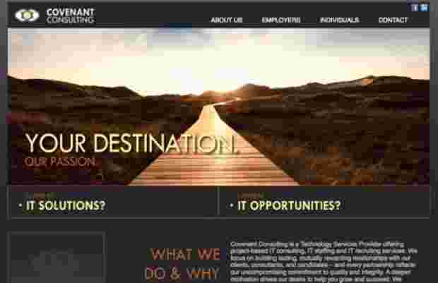
I find it particularly rewarding to help small business owners and entrepreneurs define their niche and speak effectively to their target audiences.

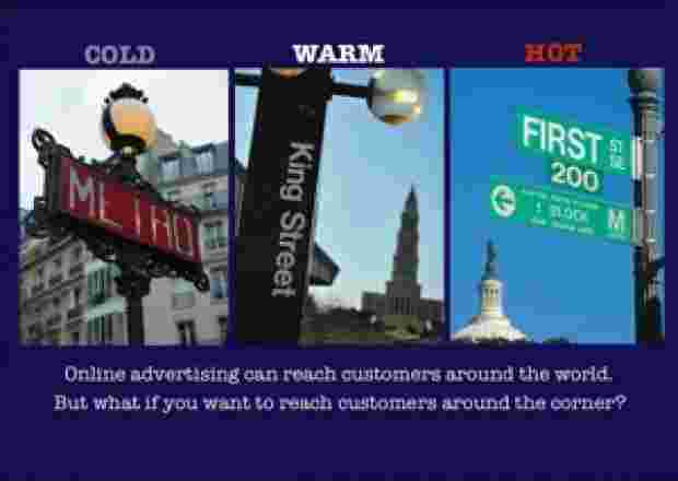
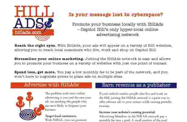
Recently, the owners of DC Access (a company that provides local WiFi service in DC) recruited  me to help develop marketing materials for an intriguing new business venture: HillAds.

HillAds is a hyper-local online advertising network that connects Hill  businesses that want to advertise with Hill websites that attract people who live and work on the Hill. The business is owned and operated by Matt Wade and Martha Huizenga, a husband-wife team who are successful local business owners with a strong commitment to the community.

First, I proposed a variety of possible taglines for the business. The winner was “Powered by Proximity” — which can be integrated into headlines and calls to action, such as “Tap into the power of proximity!”

Then I went to work on copy for a simple one-page flyer. The primary challenge was avoiding too much technical jargon while still explaining clearly the advantages of belonging to HillAds and the ins and outs of how it works for both advertisers and publishers. In addition, we needed a strong headline and featured selling points for those not inclined to read the fine print. In addition to writing the copy, I suggested a rough idea for the layout with my draft copy, including some proposed illustrations that supported the idea of “targeting” local customers.

As a cost-saving measure (and because she has the tools & experience to tackle the job) Martha did the layout for the flyer in-house, but she called on graphic designer Julia Christian to create a logo, which I *LOVE* — it incorporates the business name (which communicates a lot) into a visual that captures the essence of the business through the use of a target and a push pin, which invokes the idea of a local bulletin board. Julia also selected the color palette (which complements the DC Access colors).

I’m really pleased with the final piece and hoping that it proves an effective tool for building the business. While this is a web-based service, building the clientele will be a hands-on process, and this flyer is the core piece in a sales packet.

Most of all, I love working with small business owners, especially when they are very community minded. Yes, this is a business that is designed to make some money for the owners — but it also gives local businesses a cost-effective, streamlined way to advertise online, while giving local website owners (news sites, blogs, and businesses) an easy way to earn additional ad revenue. Plus, all that money stays in the community, rather than being funneled out by one of the web-media conglomerates that are also tapping into the trend toward hyper-local advertising. In short, it’s a GOOD business, and it feels good to be involved in helping it get off the ground.

Work sample: download the HillAds flyer (PDF).
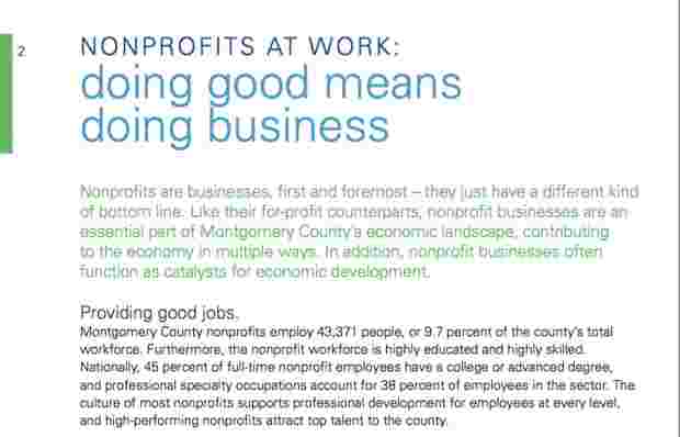
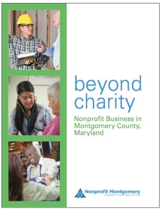
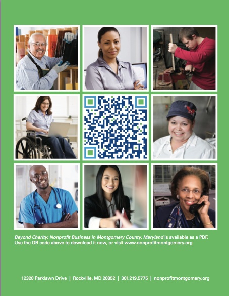
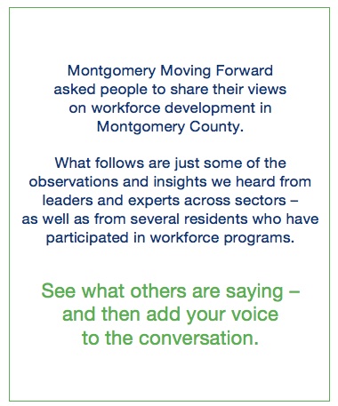
Real Time Web Analytics