Category Archives: Brochures & Flyers

Let’s Talk: Materials for a Community Conversation about Workforce Development

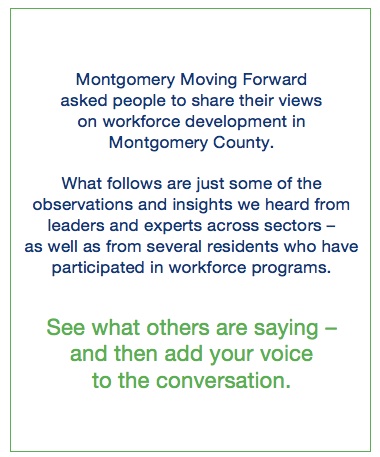
MMF Let's Talk Booklet Intro PageAs a follow-up to my work on last year’s Beyond Charity report for Montgomery County, MD, this spring I worked with Nonprofit Montgomery to help develop print materials for a Montgomery Moving Forward community conversation held at Discovery Communications on March 31, 2014.

I developed two fact sheets — “Workforce Development Trends” and “Workforce Development in Action” — as well as updating two fact sheets that I created last spring when the Beyond Charity report was initially released.

I also put together a 16-page booklet featuring 30 quotes about workforce development and a one-sheet about Montgomery Moving Forward. I was particularly proud of this piece, as I helped envision a budget-friendly way to format and organize the quotes so that they would be an attractive and compelling addition to the event packet.

Finally, I created a one sheet about Montgomery Moving Forward, drawing on existing materials and boiling them down to key messages.

Booklet: Let’s Talk: Workforce Development in Montgomery County – Voices & Viewpoints

One Sheet: Montgomery Moving Forward

Fact Sheet: Workforce Development Trends

Viewbook for The Academy of the Holy Cross: Appealing to Girls and Parents

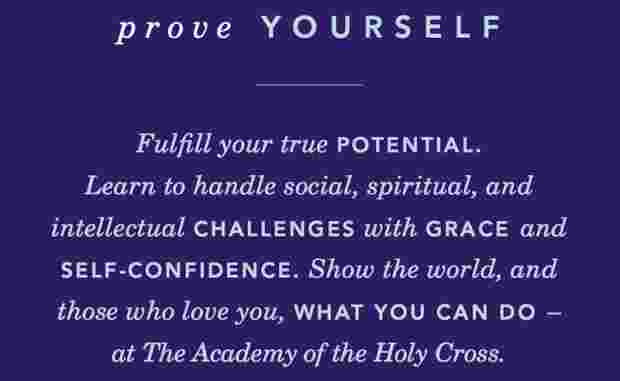
AHC_samplespreadIn 2012, I worked with Catalone Design to create a viewbook (marketing booklet) for The Academy of the Holy Cross, an all-girls Catholic high school in Kensington, MD. The primary challenge of this piece was coming up with a concept and copy that would speak directly to girls while also appealing to their parents.

To gain a good understanding on the school, I spent the better part of a day on site, along with Lisa Catalone, talking to groups of administrators, teachers (including several alum who are now on staff), and students. Holy Cross had not had a viewbook previously, so we really wanted to deliver a great product that would capture the spirit of the school and support their recruitment efforts.

After the site visit, I proposed several thematic approaches to Catalone to see what sparked their interest from a design standpoint, and we also ran ideas by the school’s director of development. We settled on a series of reflexive headlines speaking directly to girls and built the book around that concept. The cover title is “Find Yourself Here” ( on hard copies, a small purple Holy Cross button – the kind girls might collect and put on their backpacks and jackets– is affixed in the lower-right corner).

Inside, the copy progresses through a series of headlines: Prove Yourself, Push Yourself, Surprise Yourself, Know Yourself, Surprise Yourself, Enjoy Yourself, and Be Yourself. Each headline is followed by a sentence or two of large supporting copy that conveys core messages, followed by several short paragraphs in a smaller font that provide more details about the school. These pages are paired with hero shots of actual students, and interspersed between colorful, eye-catching spreads that feature collages of on-site photography. The last page of the book provides additional information for parents, but the whole book is designed to speak to parents even as it addresses girls in the second person.

As a writer, I  love seeing my words come to life in a well-designed piece, and I’m always excited to partner with Catalone because they do such beautiful work. In this viewbook, I love the extensive use of original photography, the rich color palette, the creative design of the pages featuring copy, and the overall flow and feel from start to finish.

To see the finished product, click here to flip through the viewbook.

Pleasing Lines: Web & Brochure Copy for WJE Healthcare Architects

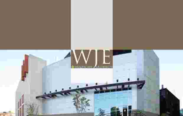
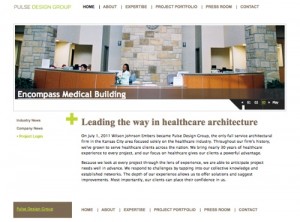
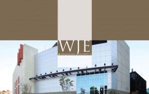
In 2007, I worked on a new website and corporate brochure for WJE Architects, a Kansas City firm specializing in healthcare architecture.

The website was designed by Matt Huggins and the brochure by Megan Hopkins (at the time, both were on staff at Spur Communications).

I really enjoyed working on this project for several reasons. First, I like it when a new website and brochure are developed at the same time. In some ways, brochure copy and web copy are two different beasts, but working on both simultaneously (or in quick succession) makes it easier to achieve consistency in voice and messaging.

Second, I think both the web design and the brochure design are exceptionally well executed. I don’t have a screen capture of the firm’s old website, but it was very, very, very dated (had that 1996 look…). Both the site and the brochure are crisp and professional — in fact, I think the brochure is in my “top 5” of print pieces I’ve worked on, as it conveys a lot of written and visual information in an elegant, engaging way. WJE needed a flagship marketing piece that would make a strong impression on potential clients and effectively convey their capabilities, and I think this brochure achieved that end.

Third, I enjoyed writing about a firm that is so well established. Writing for small and emerging businesses can be rewarding, too, but with WJE, I had a “proven product” to describe and promote. The messages about how the company works and what it can do for clients aren’t aspirational — they are founded in 30 years of experience and backed up by an impressive portfolio.

You can download a PDF of selected pages from the brochure (I took out a lot of pages that didn’t have copy because it’s a very image-heavy PDF – to see the brochure’s design in its entirety, email me and I’d be happy to share).

WJE recently changed its name to Pulse Design Group, and this change has been implemented across the website. However, most of the copy I wrote for the site remains intact. You can visit the site or download a PDF of selected web pages that feature my writing.

Advocacy Brochure for the National Network to End Domestic Violence

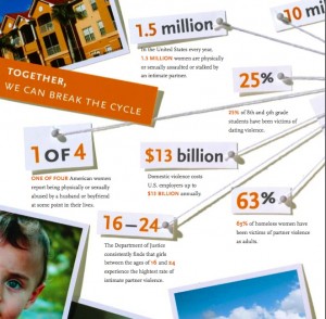
A few years ago, I wrote copy for an eight-page brochure for the National Network to End Domestic Violence (NNEDV). NNEDV is a national advocacy organization, and they wanted an informative, compelling print piece they could leave behind with legislators and Hill staffers as part of their advocacy efforts.

In a past life, I worked as office manager for Rose Brooks Center, a domestic violence shelter in Kansas City – so I know a lot about the issue and felt strongly about creating an effective piece to help NNEDV make the case for Congressional support.

The designer did a fantastic job of finding a creative approach to this tough topic. He developed an engaging scrapbook motif, including a “bulletin board” effect with key facts connected with pins and string, to show that domestic violence connects us all and affects people from every walk of life.

Download a PDF of the full NNEDV brochure.

Powered by Proximity: Helping Promote a New Venture

I find it particularly rewarding to help small business owners and entrepreneurs define their niche and speak effectively to their target audiences.

Recently, the owners of DC Access (a company that provides local WiFi service in DC) recruited  me to help develop marketing materials for an intriguing new business venture: HillAds.

HillAds is a hyper-local online advertising network that connects Hill  businesses that want to advertise with Hill websites that attract people who live and work on the Hill. The business is owned and operated by Matt Wade and Martha Huizenga, a husband-wife team who are successful local business owners with a strong commitment to the community.

First, I proposed a variety of possible taglines for the business. The winner was “Powered by Proximity” — which can be integrated into headlines and calls to action, such as “Tap into the power of proximity!”

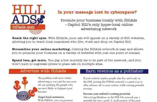
Then I went to work on copy for a simple one-page flyer. The primary challenge was avoiding too much technical jargon while still explaining clearly the advantages of belonging to HillAds and the ins and outs of how it works for both advertisers and publishers. In addition, we needed a strong headline and featured selling points for those not inclined to read the fine print. In addition to writing the copy, I suggested a rough idea for the layout with my draft copy, including some proposed illustrations that supported the idea of “targeting” local customers.
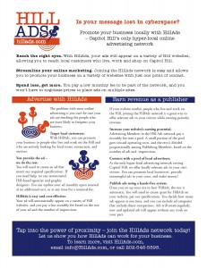
As a cost-saving measure (and because she has the tools & experience to tackle the job) Martha did the layout for the flyer in-house, but she called on graphic designer Julia Christian to create a logo, which I *LOVE* — it incorporates the business name (which communicates a lot) into a visual that captures the essence of the business through the use of a target and a push pin, which invokes the idea of a local bulletin board. Julia also selected the color palette (which complements the DC Access colors).

I’m really pleased with the final piece and hoping that it proves an effective tool for building the business. While this is a web-based service, building the clientele will be a hands-on process, and this flyer is the core piece in a sales packet.

Most of all, I love working with small business owners, especially when they are very community minded. Yes, this is a business that is designed to make some money for the owners — but it also gives local businesses a cost-effective, streamlined way to advertise online, while giving local website owners (news sites, blogs, and businesses) an easy way to earn additional ad revenue. Plus, all that money stays in the community, rather than being funneled out by one of the web-media conglomerates that are also tapping into the trend toward hyper-local advertising. In short, it’s a GOOD business, and it feels good to be involved in helping it get off the ground.

Work sample: download the HillAds flyer (PDF).
Real Time Web Analytics