Category Archives: Web Writing

Fresh Messaging for an Established Brand: Capacity Partners Website

CapacityPartners_ScreenshotStrategyPageIn 2013, I worked with Mary Robinson, president and founder of Capacity Partners, to help develop and launch a new website in conjunction with the company’s 10th anniversary. We brought in Beth Ponticello of cr8tivefocus.com (whom I have worked with many times) to customize a WordPress theme, and Beth also developed the company’s beautiful new logo.

I really love the website. It’s crisp and clean, with a slide show on the home page that highlights core messages in a visually engaging way, and a responsive theme that looks good and is easy to navigate across devices. I’ve also worked with Capacity Partners on setting up their new blog in conjunction with the website. Moving forward, I will be helping Mary and her team develop a stronger social media presence, as well as assisting with updates and maintenance on the website.

To explore the full site, visit www.capacitypartners.com


Lofty Words: Blogging from the 2013 Aspen Ideas Festival for The Atlantic

AIF_blogsampleIn June 2013 I got the incredible opportunity to attend the Aspen Ideas Festival. This was my fourth blogging gig for The Atlantic, but the previous three had been from my home base in DC. I jumped at the opportunity to go to Aspen, where I blogged and tweeted about the energy track as part of an integrated marketing project sponsored by Shell. To the right are a sampling of four headlines and deks from the blog that give an idea of the range of topics I tackled.

Prior to heading to Aspen, I wrote two pre-event blog posts, Then, over the course of four frenzied but stimulating days, I attended sessions in the Festival’s “Energy Revolution” track, tweeting highlights from a dedicated AIF2013Energy Twitter stream and then writing eight quick-turnaround blog posts in response to key themes that emerged from the panel discussions. It was a really incredible opportunity to hear experts from across sectors engage in lively conversations about our energy future.

Of course, Aspen was a beautiful and inspiring place for thinking and writing — and while I was very busy working, I did manage to steal away for an afternoon to visit Maroon Lake and get some great shots of the Maroon Bells. My favorite post from the series captures the “Aspenness” of the whole experience, and is accompanied by a photo I took at Maroon Lake: Aspen Provides Panoramic View of Energy Issues. Unlike two of my past blogging gigs for The Atlantic, I did not have a byline for the posts on this project — but I think my voice really comes through on this post. If the link is no longer working (sponsored blogs do not persist on the TheAtlantic.com indefinitely) then you can read the post as a PDF.


Speaking to Small Businesses: Web Copy for Collective Method

I recently worked with DC-based Collective Method to create copy for its new website. CEO Sharee Lawler was reinventing and rebranding her consulting business (formerly known as Black Lab Advisory) and needed clear, compelling language that would describe what Collective Method does and how it works.

I’m pleased with the results, including the site’s tagline — “One partner. Many solutions.” — which came out of headline copy that I proposed.

As part of the network of professional consultants that Collective Method draws on to create teams to meet its client’s needs, I was particularly excited to help promote its services. You can see my words — and learn what Collective Method is all about — by visiting the Collective Method website.

Pleasing Lines: Web & Brochure Copy for WJE Healthcare Architects

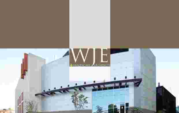
In 2007, I worked on a new website and corporate brochure for WJE Architects, a Kansas City firm specializing in healthcare architecture.

The website was designed by Matt Huggins and the brochure by Megan Hopkins (at the time, both were on staff at Spur Communications).

I really enjoyed working on this project for several reasons. First, I like it when a new website and brochure are developed at the same time. In some ways, brochure copy and web copy are two different beasts, but working on both simultaneously (or in quick succession) makes it easier to achieve consistency in voice and messaging.

Second, I think both the web design and the brochure design are exceptionally well executed. I don’t have a screen capture of the firm’s old website, but it was very, very, very dated (had that 1996 look…). Both the site and the brochure are crisp and professional — in fact, I think the brochure is in my “top 5” of print pieces I’ve worked on, as it conveys a lot of written and visual information in an elegant, engaging way. WJE needed a flagship marketing piece that would make a strong impression on potential clients and effectively convey their capabilities, and I think this brochure achieved that end.

Third, I enjoyed writing about a firm that is so well established. Writing for small and emerging businesses can be rewarding, too, but with WJE, I had a “proven product” to describe and promote. The messages about how the company works and what it can do for clients aren’t aspirational — they are founded in 30 years of experience and backed up by an impressive portfolio.

You can download a PDF of selected pages from the brochure (I took out a lot of pages that didn’t have copy because it’s a very image-heavy PDF – to see the brochure’s design in its entirety, email me and I’d be happy to share).

WJE recently changed its name to Pulse Design Group, and this change has been implemented across the website. However, most of the copy I wrote for the site remains intact. You can visit the site or download a PDF of selected web pages that feature my writing.
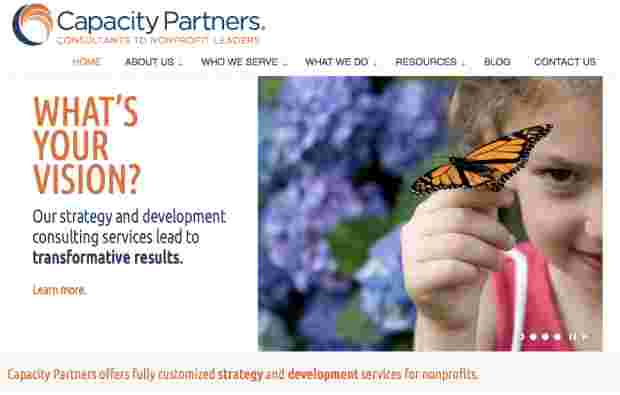
Hi-Tech with a Human Touch: Messaging & Web Copy for Covenant Consulting

In 2011, I worked with Tacklebox Marketing on a new website for Covenant Consulting, a Kansas City-based IT consulting firm.

Before tackling the web copy, I developed a core messaging document that lays out four key messages and associated benefit statements. Covenant has two primary audiences: businesses that need IT solutions and IT professionals who are looking for work. The messaging document helped me get a handle on the company’s strengths and differentiators, as well as the “so what” factors for its two distinctly different audiences.

Once the messaging document was nailed down, I worked on translating those messages and benefits into marketing language for the website. One of the things that makes Covenant unusual is that the company has a strong commitment to helping orphans in Uganda and around the world. The site needed to be a serious IT site, conveying that Covenant has the knowledge and resources to deliver great results — but the site also needed to speak to the humanitarian vision that is a driving force for the company.

I think the designer/developer, Jason Norberg, did a great job creating an easy-to-navigate site that balances an hi-tech feel with the human touch that makes this company unique. I really enjoyed working on this project, and I look forward to watching Covenant Consulting continue to grow and succeed.

Click here or on the screen shot above to visit the website, which launched in July, 2010.

Or you can download a PDF with page captures of the full site in a single document.

Letter of the Law: Web Copy for KC Attorney Mike Martin

In 2011, I had the opportunity to develop new web copy for Mike Martin Law, including message-driven copy for the home page and four practice-area pages (probate, trusts, estate planning, and business law).

The site’s design template was already in place, but the home page was pretty much a blank slate, with a strong tagline at the top (“Persistence That Gets Results”), a photo of Mike, and a lot of empty space. The new home page features strong messaging to support the tagline, an overview of Mike’s practice areas, and a clear call to action.

While the old home page didn’t say enough, the old practice-area pages were overwhelming. They were very long (scroll scroll scroll), offering a lot of in-depth information about probate, etc., but not a lot of information about why someone would want to hire Mike Martin. I worked with Mike and Suzanne Schutt of Tacklebox Marketing to shorten the pages up and shift the focus. We used more headers and bullet points to break up the text and make it easier to read, included a call to action on each page, and tied everything together with core messaging so that the site feels cohesive. Finally, I wrote Mike’s professional bio for the About page (which formerly just listed his degrees and professional associations).

All these improvements not only make the site more informative and compelling for potential clients, but they should also help with SEO. Check out the full site here: Mike Martin Law.

Real Time Web Analytics