JCA Interages – 2016 Volunteer Campaign

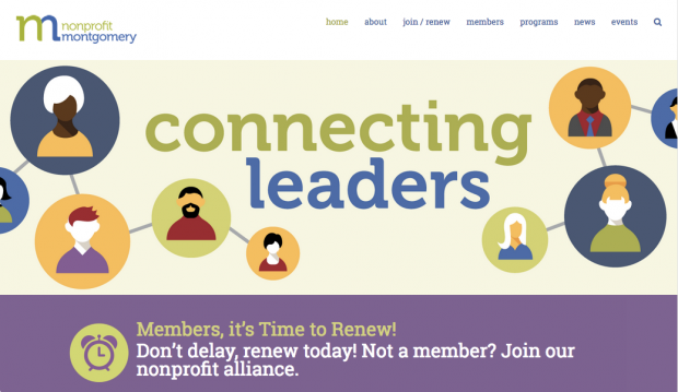
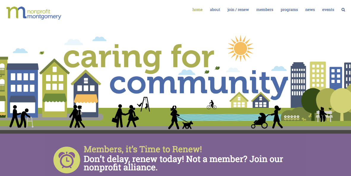
In 2015, I partnered with CEDC (Beth Ponticello, Art Director) to develop a new WordPress website for Nonprofit Montgomery. As part of the project, Beth developed a newl ogo for the organization (which had formerly been under the umbrella of the now-defunct Nonprofit Roundtable) and established brand colors. The site features an eye-catching home-page slider with key messaging, a membership signup form with fully integrated payment processing, and a blog-driven News page. I am especially proud of this site because it was developed and launched in under two weeks. My familiarity with Nonprofit Montgomery made it possible to develop the site so quickly, since I already had a nuanced understanding of the organization’s mission and programs. I have continued to assist with ongoing site administration and development, including the addition of program enrollment forms, a post-driven event calendar, and a donation form. Visit the site at nonprofitmoco.org
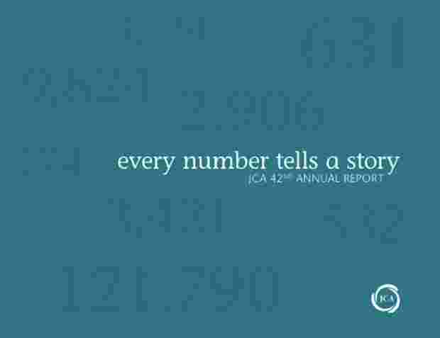
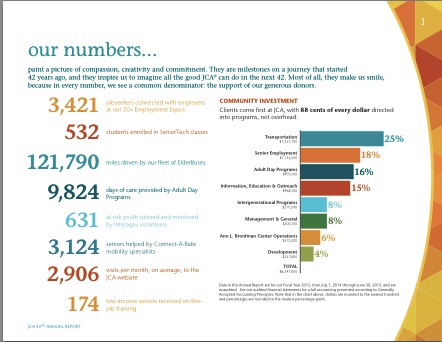
In my role as senior writer/editor at the Jewish Council for the Aging of Greater Washington (JCA), one of my responsibilities was creative development and copywriting for the agency’s annual report. For the 2015 report, I chose to work with CEDC (Beth Ponticello, Art Director) and we developed a design around the theme of “every number tells a story.” The cover uses one of JCA’s primary brand colors — a calming teal blue — sprinkled with seemingly random numbers that are “floating” in darker blue. Those numbers were varnished during the print process, creating a sophisticated, eye-catching effect for those viewing hard-copy reports. In contrast to the solid blue cover, the inside introduces a broad palette of bright colors, starting with page 1 where the numbers on the cover are put in context and brought to life in a list of featured program accomplishments for the fiscal year. View the PDF.
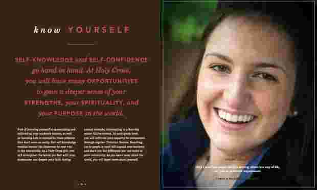
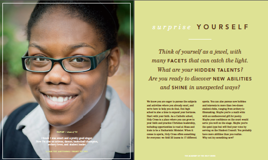
In 2012, I worked with Catalone Design to create a viewbook for The Academy of the Holy Cross, an all-girls Catholic high school in Kensington, MD. The primary challenge was coming up with a concept and messaging that would speak directly to girls while also appealing to their parents. I proposed several thematic approaches to Catalone to see what sparked their interest from a design standpoint. We settled on a series of reflexive headlines speaking directly to girls and built the book around that concept. The title is “Find Yourself Here” and the copy inside progresses through a series of headlines: Prove Yourself, Push Yourself, Surprise Yourself, Know Yourself, Surprise Yourself, Enjoy Yourself, and Be Yourself. I love seeing my writing come to life in a well-designed piece, and I’m always excited to partner with Catalone because they do such beautiful work. To see the finished product, click here to flip through the viewbook.
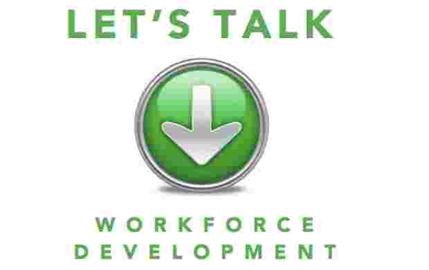
As a follow-up to my work on a Beyond Charity report for Montgomery County, MD, I worked with Nonprofit Montgomery to help develop print materials for a Montgomery Moving Forward community conversation held at Discovery Communications on March 31, 2014. I developed two fact sheets — “Workforce Development Trends” and “Workforce Development in Action” — as well as updating two fact sheets that I created in 2013 when the Beyond Charity report was first released. I also put together a 16-page booklet featuring 30 quotes about workforce development. I was particularly proud of this piece, as I helped envision a budget-friendly way to format and organize the quotes so that they would be an attractive and compelling addition to the event packet. Finally, I created a one sheet about Montgomery Moving Forward, drawing on existing materials and boiling them down to key messages.
Booklet: Let’s Talk: Workforce Development in Montgomery County – Voices & Viewpoints
One Sheet: Montgomery Moving Forward
Fact Sheet: Workforce Development Trends
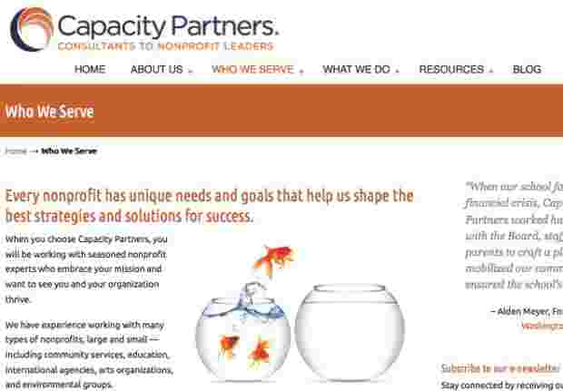
In 2013, I worked with Capacity Partners to develop a new website in conjunction with the company’s 10th anniversary. Beth Ponticello of cr8tivefocus.com customized the WordPress theme, and she also developed a beautiful new logo. The website is crisp and clean, with a slider on the home page that highlights key messages in an engaging way. To explore the full site, visit www.capacitypartners.com
As part of an integrated marketing project, I wrote a two-page advertorial that appeared in the July/August 2012 issue of The Atlantic. From May to July 2012, I worked with The Atlantic on a campaign that involved attending the magazine’s Technologies in Education Forum and then writing 18 posts for a sponsored blog (entitled “Workforce of Tomorrow”) over the next two months. The sponsor of the hub was The Apollo Group (parent company to the University of Phoenix), and the marketing package included a two-page advertorial in the print magazine. I probably don’t have the temperament to work at an ad agency, but this was my “Madison Avenue moment” and I did my best to channel my inner Peggy Olson and deliver top-notch copy. The biggest challenge was that due to print production deadlines, this 600-word advertorial had to be written and approved by the client long before I had begun working on the blog (or even attended the Tech in Ed event). The two-page ad was designed to promote The Apollo Group and drive traffic to the online hub. View a full-size PDF of the ad.
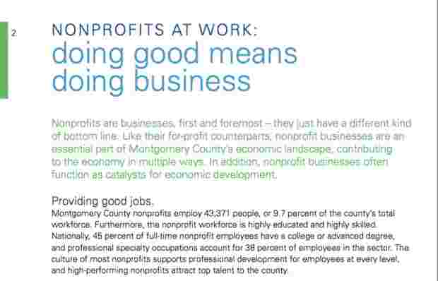
I worked with Nonprofit Montgomery (an affiliate of the Nonprofit Roundtable of Greater Washington) to create this 20-page report that documents the economic impact of nonprofits in Montgomery County, MD. This report brings together key economic data related to the nonprofit sector from several sources, along with specific examples of nonprofit economic impact. It was released at a special event on Feb. 11, 2013, held at Discovery Communications. The report was designed by Beth Ponticello at CEDC. This report was modeled on the original Beyond Charity report for Greater Washington published by the Nonprofit Roundtable in 2007, for which I was the lead writer. Download the report as a PDF.
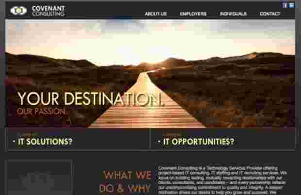
In 2010, I partnered with Tacklebox Marketing to develop a new website for Covenant Consulting, a Kansas City-based IT consulting firm. First, I worked with Dustin PIttman, the company’s founder, to develop core messaging. Covenant had two primary audiences: businesses that need IT solutions and IT professionals looking for work. The messaging process helped identify “so what” factors for these two distinctly different audiences. Then I translated messages and benefits into marketing language for the site. One of the things that made Covenant unusual was that the company had a strong commitment to helping orphans in Uganda and around the world. The site needed to convey that Covenant had the IT knowledge and resources to deliver great results — but also needed to speak to its humanitarian vision. I worked on the Covenant website in 2010 and it has since been redesigned. You can download a PDF with page captures of the version I helped develop.
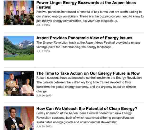
In June 2013 I got the incredible opportunity to attend the Aspen Ideas Festival. This was my fourth blogging gig for The Atlantic, but the previous three had been from my home base in DC. I jumped at the opportunity to go to Aspen, where I blogged and tweeted about the energy track as part of an integrated marketing project sponsored by Shell, writing a total of 10 blog posts. My favorite post from the series captures the “Aspenness” of the whole experience, and is accompanied by a photo I took at Maroon Lake: Aspen Provides Panoramic View of Energy Issues. Unlike two of my past blogging gigs for The Atlantic, I did not have a byline for the posts on this project — but I think my voice really comes through on this particular post. If the link is no longer working (sponsored blogs do not persist on the TheAtlantic.com indefinitely) then you can view the post as a PDF.
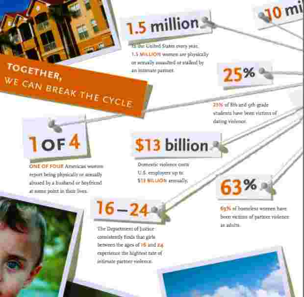
A few years ago, I wrote copy for an eight-page brochure for the National Network to End Domestic Violence (NNEDV), which is a national advocacy organization. They wanted an informative, compelling print piece they could leave behind with legislators and Hill staffers as part of their advocacy efforts. In a past life, I worked as office manager for Rose Brooks Center, a domestic violence shelter in Kansas City – so I knew a lot about the issue and felt strongly about creating an effective piece to help NNEDV make the case for Congressional support. Designer Matthew Huggins (who was part of the team at Spur Communications at the time) did a fantastic job of finding a creative approach to this tough topic. He developed an engaging scrapbook motif, including a “bulletin board” effect with key facts connected with pins and string, to show that domestic violence connects us all and affects people from every walk of life. Download PDF of the NNEDV brochure.
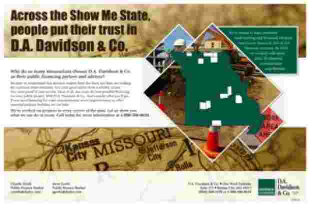
In 2011, I worked with Tacklebox Marketing on a trade magazine advertisement for D.A. Davidson & Co., a Kansas City firm that provides financing and underwriting for public projects in municipalities and water districts across Missouri. The firm’s previous ad contained a lot of great information, but it wasn’t very engaging visually. We saw the opportunity to highlight some of the firm’s key selling points by developing a stronger conceptual frame. I really enjoy working on projects like this, where the word count is limited and the challenge is to find a good hook and then choose just the right words. Since this branch of the firm only serves clients in Missouri, that allowed us to work on a Missouri-specific theme, which naturally led to the “Show Me State.” Then the trick was to work with that familiar moniker without sounding clichéd (among other things, this phrase appears on the state’s license plates). I think we struck just the right balance, thanks in large part to great design work by David Tierney. The ad is a two-page spread, and the clean, well-balanced layout makes the information easy to access and understand. View larger image of ad.
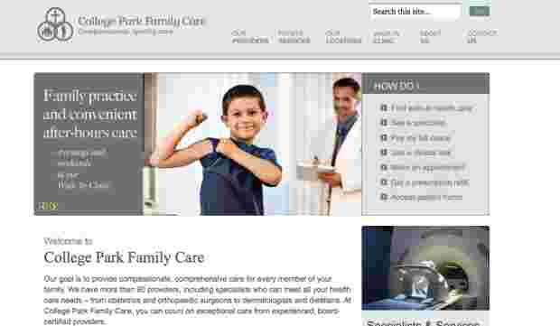
In 2010, I worked with a team of consultants to help College Park Family Practice launch a new website. This large, well established practice has more than 90 providers at multiple locations in Johnson County, KS. They needed a site that was easy to use, allowing current and potential patients to find information quickly and easily. The site also needed strong key messages to distinguish the practice in the local healthcare marketplace. Before writing, I worked with CPFC staff and the consulting team to develop core messaging – an important step that made it much easier to develop content for the site. Then I worked closely with CPFC staff to develop the content. The new website accurately and effectively conveys key information about the practice. The site is friendly, inviting, and easy to navigate – thanks in large part to the great work of designer/developer Jason Norberg. The About Us page is a good starting point to read some of the message-driven copy I crafted for the site.
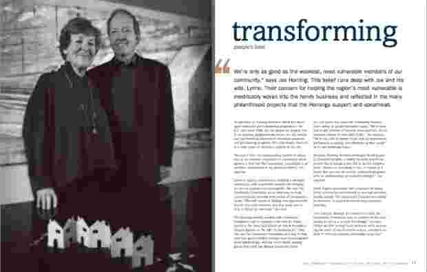
Prior to moving to DC and becoming a freelancer, I worked in marketing at the Greater Kansas City Community Foundation. That experience helped open doors in DC, where I was able to work on a number of projects for the Community Foundation for the National Capital Region (CFNCR). I wrote the quarterly newsletter for CFNCR for nearly three years, and also worked on several special reports and marketing pieces. For instance, in 2005 I wrote five donor profiles for CFNCR’s annual report. I particularly enjoyed working on this group of profiles because I had great conversations with some really committed, visionary philanthropists, including Joe and Lynne Horning. Each profile had a key word as its title that also appeared on the cover of the report – for the Hornings, that word was “transforming.” View sample profile (PDF)
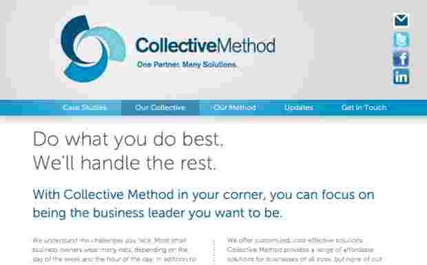
I worked with DC-based Collective Method to create copy for its new website. CEO Sharee Lawler was reinventing and rebranding her consulting business (formerly known as Black Lab Advisory) and needed clear, compelling language that would describe what Collective Method does and how it works. I’m pleased with the results, including the site’s tagline — “One partner. Many solutions.” — which came out of headline copy that I proposed. As part of the network of professional consultants that Collective Method draws on to create teams to meet its client’s needs, I was particularly excited to help promote its services. You can see my words — and learn what Collective Method is all about — by visiting the Collective Method website.
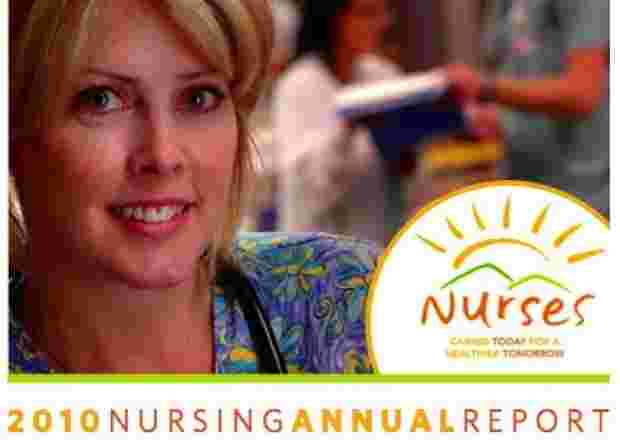
In 2010, I wrote the Nursing Annual Report for Shawnee Mission Medical Center in Overland Park, Kansas (I also wrote the 2008, 2009 and 2011 reports). The report is published each year in late April to coincide with National Nurses Week, which runs from May 6 to May 12 (Florence Nightingale’s birthday). Among other things, it is used as a recruiting tool for new nurses. For the 2010 report, I wrote five articles of varying lengths, and also worked with Sheri Hawkins, Nursing CEO, on crafting her letter for the front of the report. The primary focus of the 2010 report was patient safety, including topics like bedside communication and fall prevention. My favorite piece to write was about simulation drills in the perinatal and progressive care units using a high-tech medical mannequin. Download that two-page story – or take a look at the full report to see the complete package.
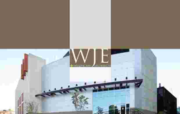
In 2007, I worked on a new website and corporate brochure for WJE Architects, a Kansas City firm specializing in healthcare architecture. The website was designed by Matt Huggins and the brochure by Megan Hopkins (at the time, both were on staff at Spur Communications). Both the site and the brochure were crisp and professional – in fact, I think the brochure is in my “top 5” of print pieces I’ve ever worked on, as it conveyed a great deal of written and visual information in an elegant, engaging design. WJE needed a flagship marketing piece that would make a strong impression on potential clients and effectively convey their capabilities, and I think the brochure achieved that end. Here is a PDF of selected pages from the brochure (I removed pages that didn’t feature copy because it’s a large image-heavy file – to see the brochure’s design in its entirety, drop me a line). WJE later changed its name to Pulse Design Group, and the website has been through a major redesign. However, much of the web copy I wrote in 2007 has persisted.